 At Home
Everywhere a Sign
My neighbor enlisted me to build the sign for his storefront. Rather unusual as far a projects go, it didn’t seem beyond my ability in any way, so I went ahead with it. The cost of regularly sourcing a business sign is high, as is everything business related, so given the current market conditions, this seemed like a nice way to give a leg up in an otherwise difficult area.
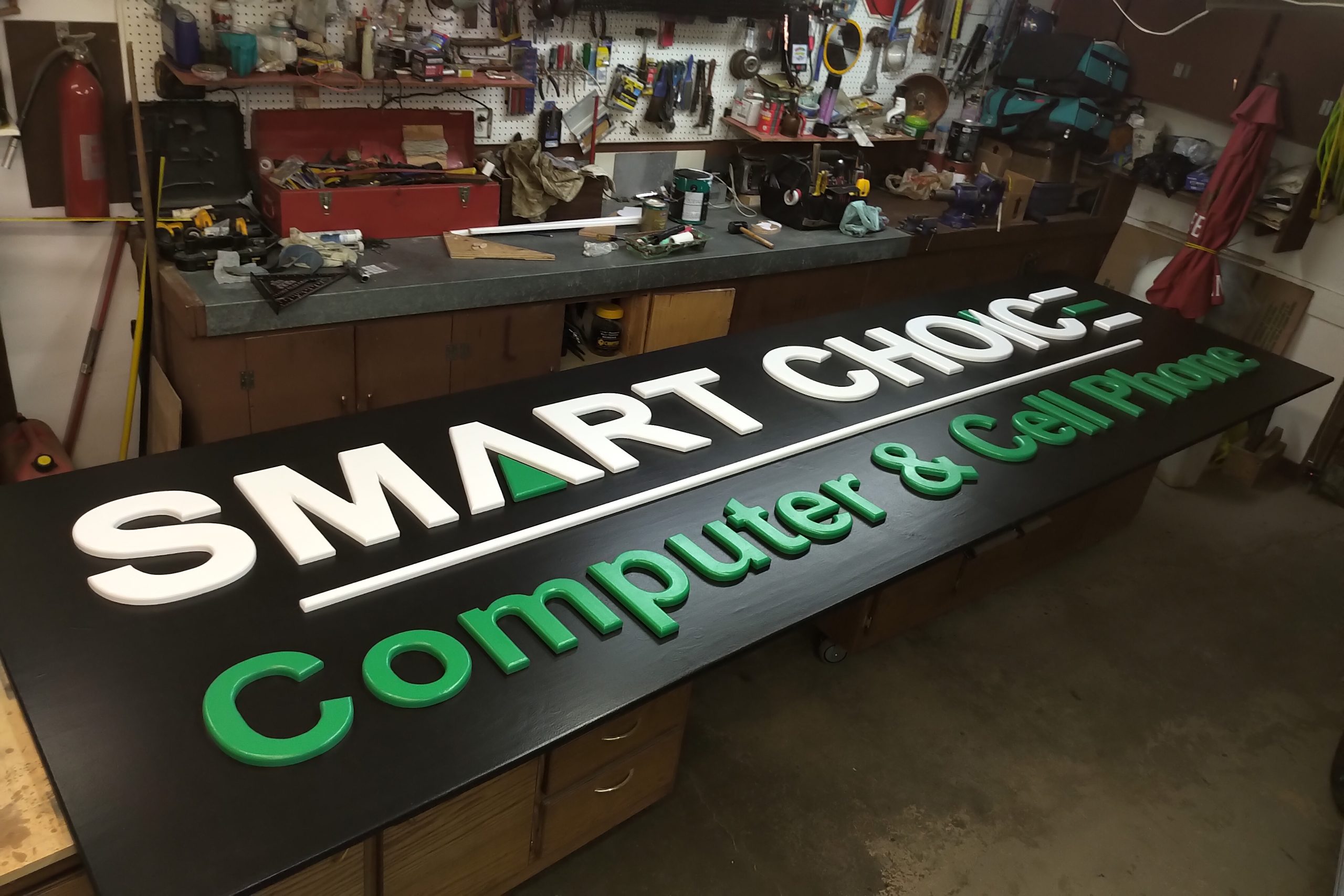
The logo is rather simple, or so it looks at first. What he wanted was the letters cut out and mounted to the surface so that all the lettering was raised 3/4″. Most commercial signs have letters 2 or 3 inches tall, or greater, but this is the budget option. For this I needed the sign printed out, and after a preliminary look at getting it done here, I handed the task back to him to wrestle with, and after a few days he supplied me with two rolls of lettering from a 36″ printer he had just bought.
Better him than me, because those printers are a fortune and, if not used regularly, will plug up and encounter all sorts of maintenance problems the cheap desktop printers just don’t have. I’d have gone to a print shop myself, but whatever.

Although there are only three colours here, the first thing I noticed was the black background, which is problematic at best, and in general, just a pain in the ass to work with. At first, he wanted to use flat black, which I argued strongly against, as that is just what a chalk board is made of.
Thankfully he agreed to semi-gloss paints for the entire thing, and that alleviated a slew of difficulties. Hands had to be religiously clean throughout construction, but at least the surface would be washable.
The sign itself was made with a type of plywood called MDO, which stands for Medium Density Overlay. This is a product specifically designed for sign making, with a hard and flat surface overlaid on weatherproof fir plywood. This we found at Timber Town on 99th St on the southside, as Windsor Plywood was the usual rip-off at +30% the price. Three sheets – one for the letters and two for background – and we were on the way.
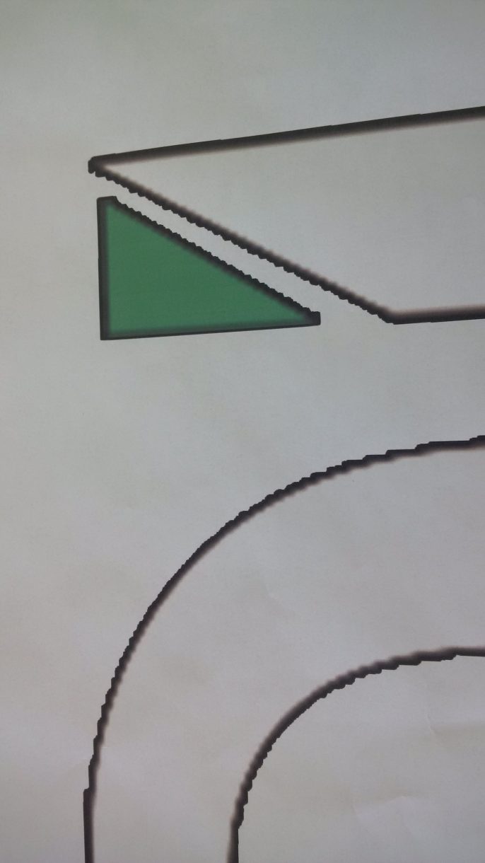
Task number one was getting the letters cut out, and for that a 36″ printer fit the bill. The lettering was a little rough and granular, but this was far better than doing it by hand.
From there the next step was to take some measurements so they could be transferred onto the sign, and then cut out all the letters. I wrote the measurements along the bottom of the printout, and then cut off the bottom 4 inches to roll out later as a guide.
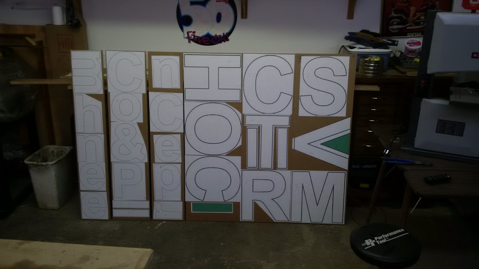
Once they were cut out, laying them out efficiently was the next task. I had simply assumed all the letters would fit onto one sheet, but I have to admit to some relief when I saw it in reality.
Here they are, laid out and cut into strips for ease of handling. Spray on glue was used, sparingly, on the paper, then pressed into place.
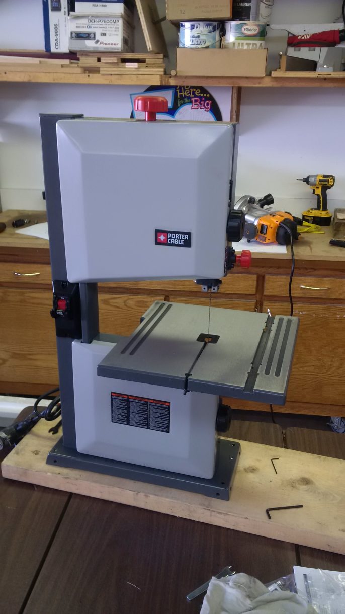
Next came cutting the letters out with the cutest little band-saw I’ve ever seen. Though the working area (distance between blade and arm) of this thing was quite small, the narrow blade (depth) made cutting sharp corners manageable. As a “first use” gadget, it was OK, but just barely. By the end of cutting, the band had stretched so that there was no more tension adjustment left in the big red dial at the top. Further use would deteriorate as the band continued to age and slacken, and well, you get what you pay for.
So, with a pile of letters cut out, the edges needed to be worked to remove the saw marks and inevitable “whupsies” that happen when cutting tight curves.
For that, he bought another little dinky sander (Princess Auto this time), which was used to take off the marks on the outside edges and curves. What remained were the inside curves, for which I made a little tool myself.
A piece of broom handle, a long lag bolt with the head cut off, and spray on glue. Shazaam! One Schpindalizer.
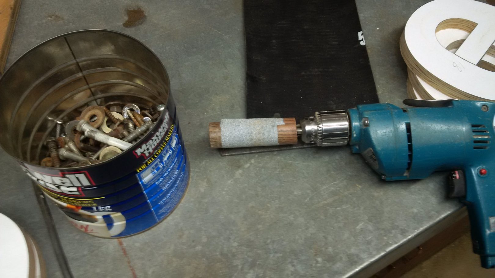
It worked surprisingly well, and got all the letters prepped for the next step, which was rounding over all the edges with the router. Slow and easy was the theme here, as I’ve put some serious miles on this bit already. The results were good, but doing so exposed voids which then needed to be filled and sanded.
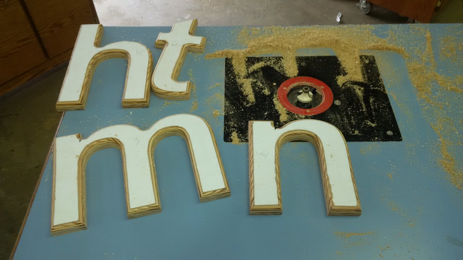
Once at this stage, the real work of the project began, so not all of it was documented. Tedious and repetitive, each letter had to be gone over time and again, until the edges were ready to be be primed for paint.
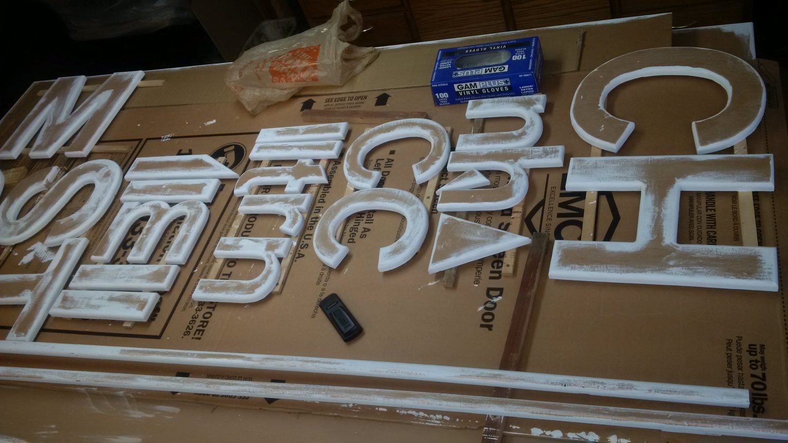
Even then, the priming raised the grain and exposed more voids that had been missed, so another round of sanding and filling was called for. I kept trying to remind myself that it was going to be 10 feet up in the air, but I just can’t seem to half-ass it, no matter the situation. Good, bad, ugly… call it what you want, eventually… they were ready for paint.
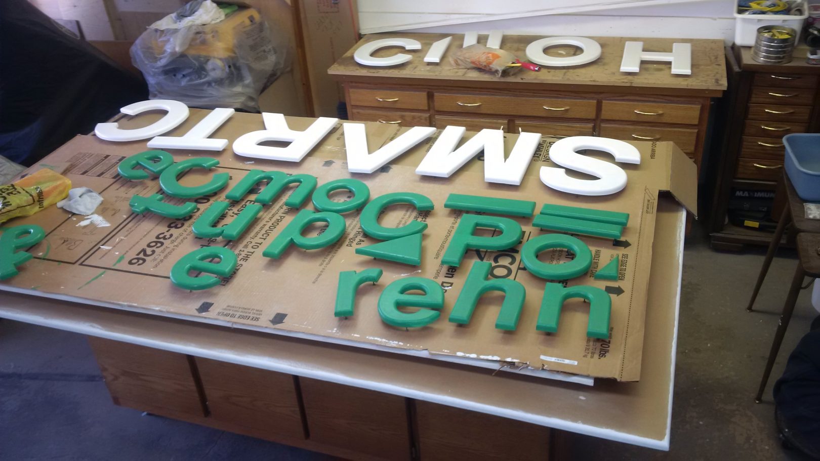
Each letter has three little screw legs in the backside, and after two coats of paint, they were set aside while the base was painted. This went better than I thought it would. I have developed a method to smooth out roller lines over the years as I painted the house, yet still, black paint is a bitch, and if you look close enough you can make them out, but that was the best I could do. It remains to be seen how it will look once it is hung in natural lighting.
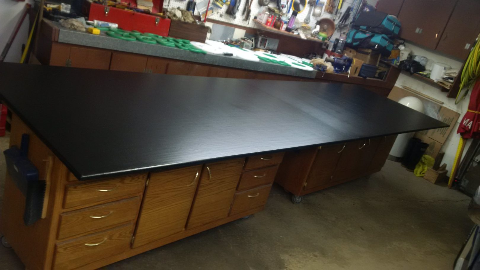
I used biscuits (glued on one side) which worked quite well on the seam to align the sheets,. A few scraps screwed to the backside, and a clamp between them brought the edges together for layout.
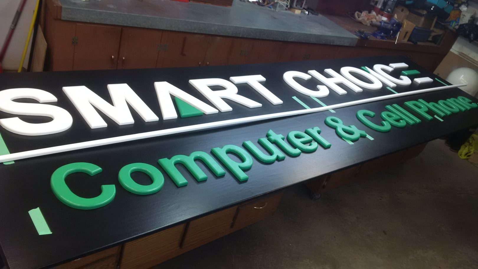
Starting to look pretty sweet, if I do say so myself. ![]() Here, I’ve just got them laid out in anticipation of final placement. I have to admit, after a week and some of putzing about getting up to this point, I was actually a bit nervous, but you can only think something through so many times before you just have to forge ahead and hope any difficulties can be overcome.
Here, I’ve just got them laid out in anticipation of final placement. I have to admit, after a week and some of putzing about getting up to this point, I was actually a bit nervous, but you can only think something through so many times before you just have to forge ahead and hope any difficulties can be overcome.
There weren’t any problems, really. Mostly, I just didn’t like to face nail through the letters and ruin the nicely painted surface, but there really wasn’t any other option, and my brad nailer only left a small hole which filled easily. Once the filler had dried, it was a matter of washing it off, and adding a few more coats of paint to the lettering.
Et Voila!
You can right click the image and open it in a new tab to see the full size.

The “&” sign isn’t nailed, as it sat right on the seam, so will have to be affixed on site. The green lettering, which was Glidden “Premium”, didn’t cover the nail marks as well as the Behr white, so I’ll remember that if I end up doing this again. The black Behr paint was a weird texture when you opened the can. Just weird…. like junket (if anyone ever lived in the UK before), and needed to be re-shook to get it smooth again, and even then it came back the consistency of pudding. As I said, weird.
Ledgers were finally screwed and glued to the backside to support the sign evenly on 2×4’s mounted on location. Some scaffolding will be needed to ensure it can be placed safely, and a block and hammer will be needed to knock the two mating edges together.
This was a LOT more work that first met the eye, but now I know. Learning, and challenge is what I like, and though relatively simple, this job held its lessons.