 At Home
Everywhere a Sign
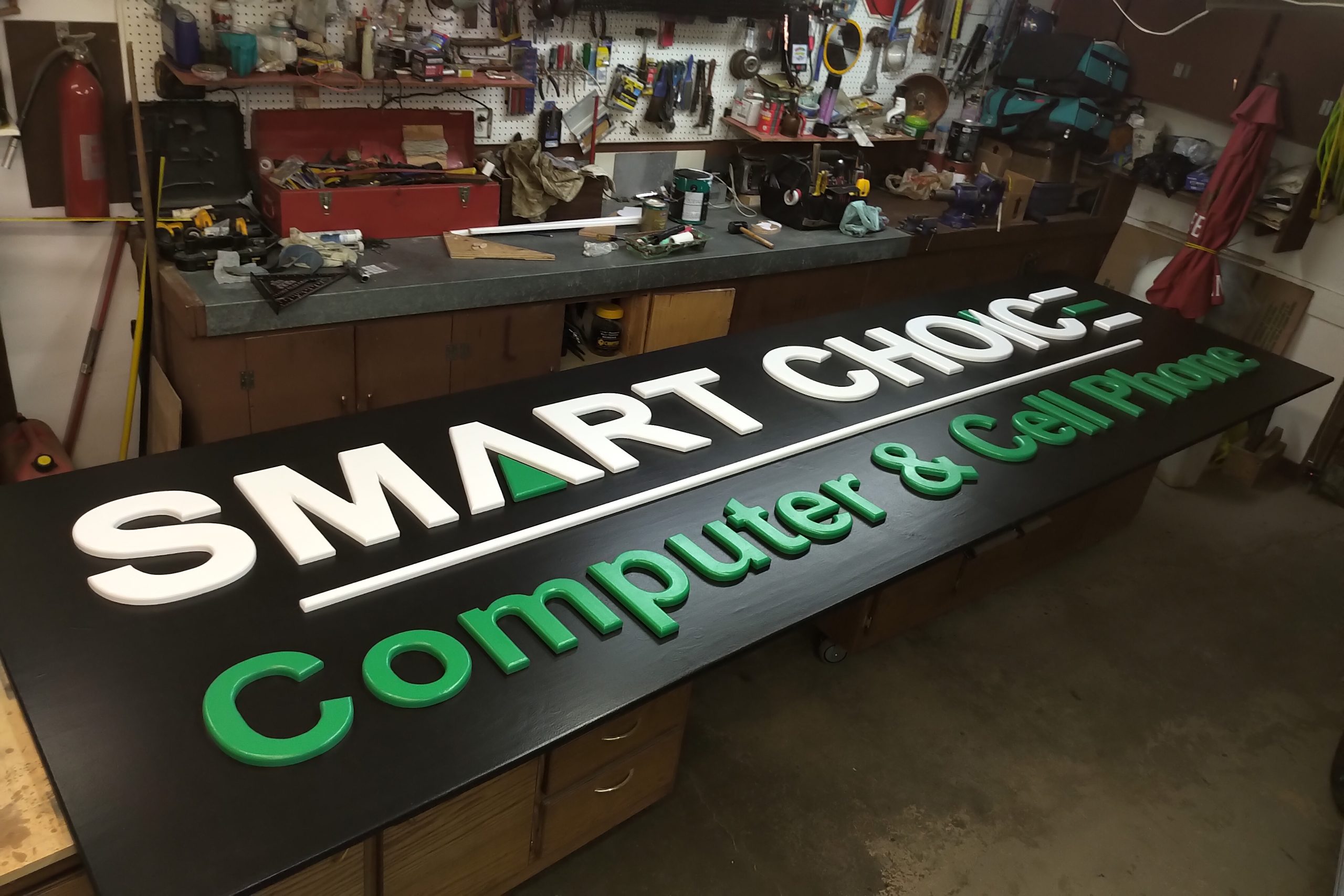
My neighbor enlisted me to build the sign for his storefront. Rather unusual as far a projects go, it didn’t seem beyond my ability in any way, so I went ahead with it. The cost of regularly sourcing a business sign is high, as is everything business related, so given the current market conditions, this seemed like a nice way to give a leg up in an otherwise difficult area.
The logo is rather simple, or so it looks at first. What he wanted was the letters cut out and mounted to the surface so that all the lettering was raised 3/4″. Most commercial signs have letters 2 or 3 inches tall, or greater, but this is the budget option. For this I needed the sign printed out, and after a preliminary look at getting it done here, I handed the task back to him to wrestle with, and after a few days he supplied me with two rolls of lettering from a 36″ printer he had just bought.
Better him than me, because those printers are a fortune and, if not used regularly, will plug up and encounter all sorts of maintenance problems the cheap desktop printers just don’t have. I’d have gone to a print shop myself, but whatever.

Although there are only three colours here, the first thing I noticed was the black background, which is problematic at best, and in general, just a pain in the ass to work with. At first, he wanted to use flat black, which I argued strongly against, as that is just what a chalk board is made of.
Read more “Everywhere a Sign”

